Helping to make text accessible to Will
Those of you who have read my posts before will already know that Will, my son, has dyslexic tendencies and ADHD.
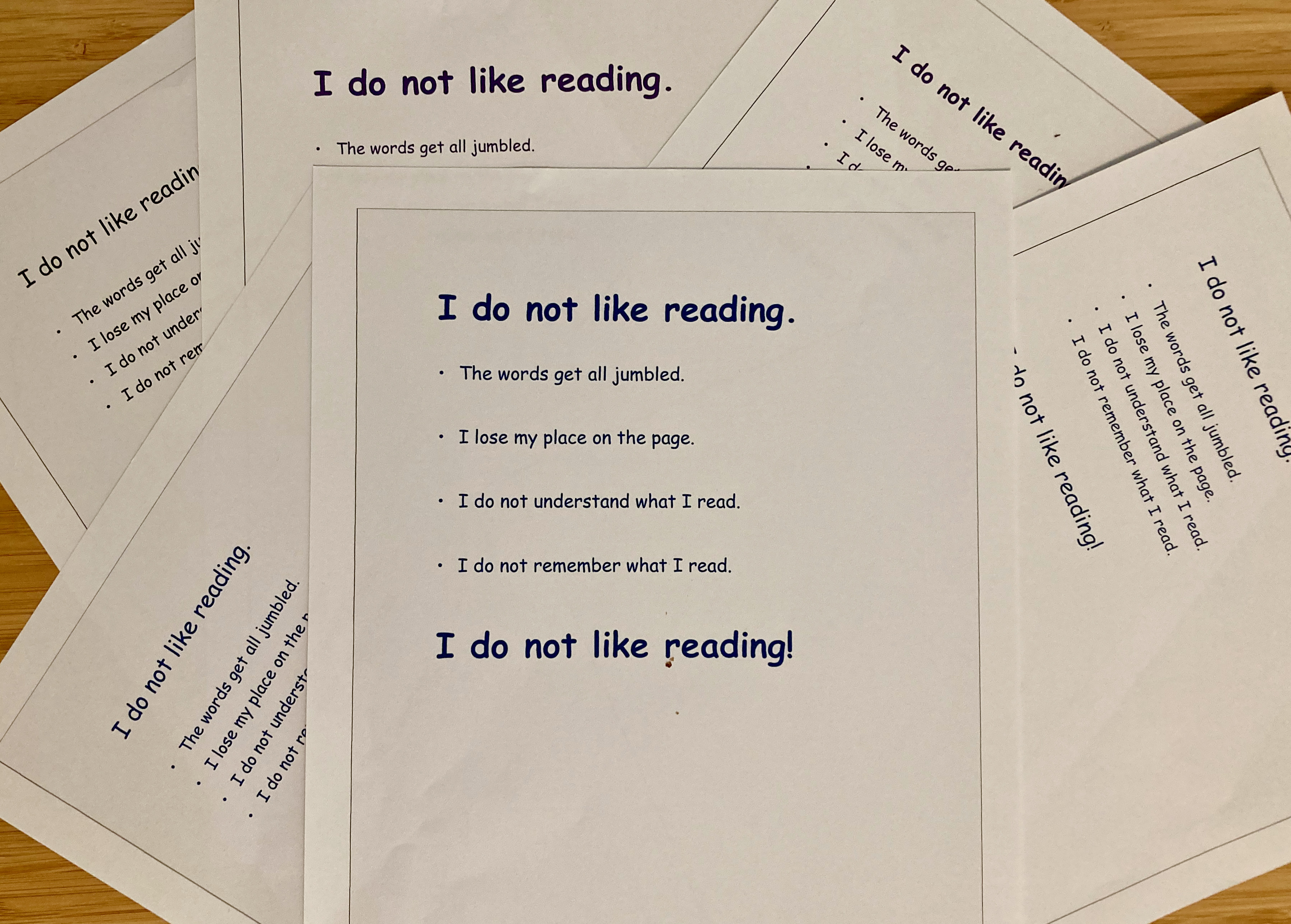
Will often finds it challenging to read and understand text, hates comprehension questions and never chooses to read for pleasure.
As a self-confessed bookworm, it took me a long time to realize why the books that I piled onto Will's book shelves stayed unopened. Eventually it clicked. Reading was, and continues to be, challenging for Will. Every time that he mis-read a word, or mis-understood the text, he felt a failure and so avoided reading as much as possible.
However, Will has found a number of strategies that help to make text less challenging for him to read and understand and that support his learning and development.
Will's Top Tips for making text more accessible:
-
Write or type text on thick matt paper. This stops the text on the other side of the paper from showing through and causing visual confusion.
-
Write or type text on cream or a soft pastel coloured paper or computer back-ground
-
White paper and computer backgrounds dazzle Will. They cause him visual stress and make text more challenging for him to read.
-
Will prefers to read text written on a gently tinted off-white background. Background colour preferences may vary between individuals.
-
-
Use Sans serif based fonts, such as Arial and Comic Sans for typed text. Using a font size of 12-14 with 1.5 line spacing helps to make text less challenging for Will to read. It makes the page appear less overcrowded and reduces visual stress.
-
Use a dark coloured text on a light background.
-
Avoid using green and red or pink text colours as these colours may create challenges for individuals with colour vision differences, e.g. colour blindness.
-
Will finds dark blue text on an off white background easiest to read. A friend of his, finds dark purple text on an off white background easier to read.
-
-
Use a font size at least 20% bigger than the rest of the text for headings. Use bold text to emphasize headings. Be aware that underlining and italics can make words appear to run into each other.
-
Include images like Flow charts in explanations, pictograms and graphics. Will finds that these help him to understand and locate information in texts.
-
Present information as bullet or numbered points instead of continuous prose where possible. Again, this helps Will to understand and locate information in texts.
-
Use text-reading software.
-
Will finds it easier to process, understand and retain information when it is read to him rather than him visually reading it himself.
-
Will finds the built in customizable text-reading software on his computer invaluable.
Will uses a computer with an Apple operating system. Text-reading software comes built in and is accessed by selecting System Preferences and then Accessibility.
Narrator is text-reading software that is built into computers that run on a Microsoft Windows 10 operating system.
-
-
Use Audio versions of texts, e.g. novels. Will finds that listening to a text being read out as he follows it in a book really helps him to remember and understand it.
Other posts that you might like:
Understanding Will part 5 - I don't know how to start my writing